5 Things Your Church Homepage Needs
By The A Group


Your church website is the most important thing as it relates to attracting new visitors. Ok, maybe not the most…but it’s up there on our list. :)
You can’t afford to turn a blind-eye to this invaluable tool. As a church, your potential guests are first arriving to your site before ever deciding if they are going to attend for the first time. Here are our top five recommendations for elements that should be on your church's homepage to help them on their journey into a seat on Sunday.
1. “New Here” call to action
Church homepages should first and foremost be used as a tool for attracting first-time guests. Visiting a church website assumes much less risk for someone than pulling up to an actual building, uncertain of what one is going to experience. For this reason, we need to make that first online experience easy, welcoming, and informative.
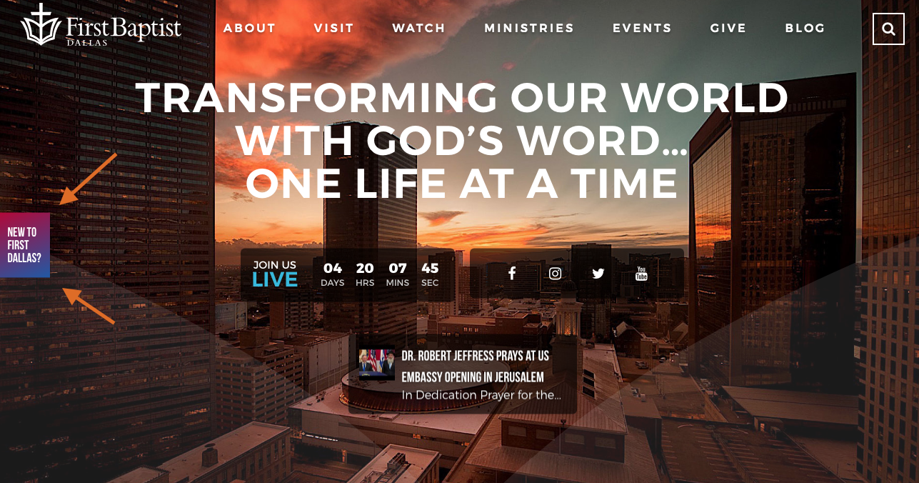
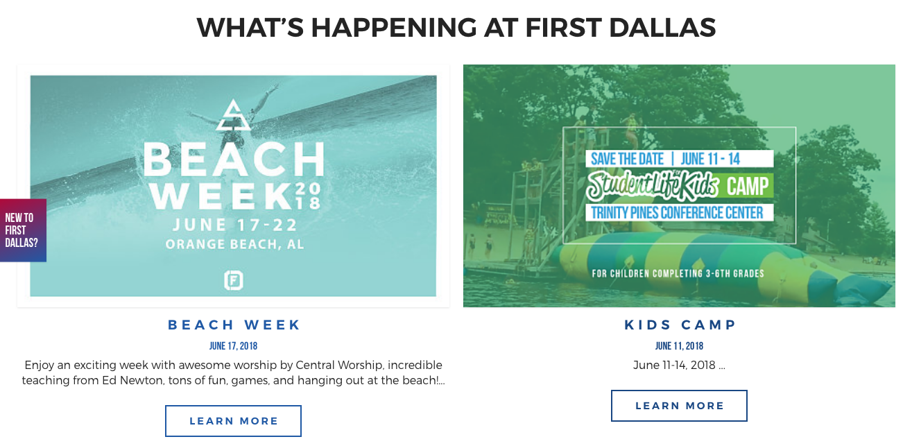
Add a “New Here” or “I’m New” call to action (CTA) above the fold on your website. Some churches, like our awesome client First Baptist Church Dallas, chose to add this CTA in the hero space:
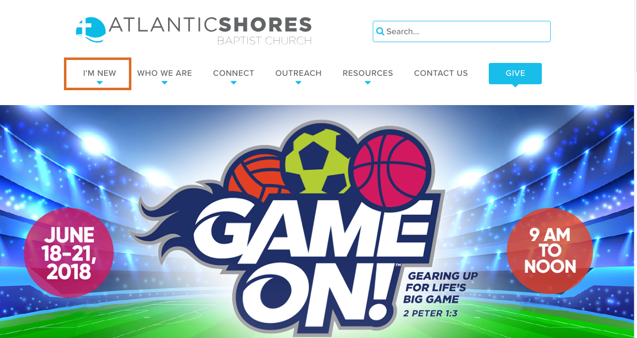
And some churches choose to include it in the navigation:
Once you choose where to add the CTA, ensure that the information on that page is useful and inviting, not using any internal language that would require the context of someone who attends regularly.
2. Service time(s) and location(s)
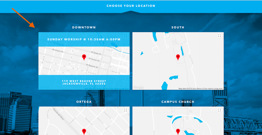
Don’t assume that your church location is obvious. This will be one of the first things people are curious about, as they will want to see if you’re in their community to begin with. Make sure that you not only provide the name of the campus, but also the exact address where it can be located (make sure it’s clickable and can be actionable on a mobile device, as well).
Along with the location, the service times should accompany each location to give the potential guest a snapshot of their options. This can be done in various ways, but here’s an example of how to show all the pertinent information in a concise manner (the below is the hover state of the map).
If you don’t want to use a “map” as a visual for your location, it’s also nice to show the front of the building that the guest can expect to see. Visuals of the building will help them feel comfortable when visiting for the first time, as they know what to expect when they pull up.
3. Brand messaging
This is a big one. Many churches make the false assumption that a first-time website visitor knows that you are (A) a church or (B) fall under a particular faith category. Do not make this assumption.
Make sure that within seven seconds, a user can identify who you are and what you stand for. The hero is the perfect place for you to place your church’s brand promise (which should be clear and memorable) and call to action to take them deeper into the discovery process. Deeper into the website, make sure you have a more comprehensive message that allows the potential first-time guest to continue to see who you are, what you do, and how you do it. You’re doing incredible things! Now, let’s make sure it’s communicated well.
4. Images and/or video of your people
People connect with people. They immediately look to images on your website to see if they can fit in at your church. Show images of people in the lobbies talking, in community with each other, and involved in activities at the church. Here’s a short list of things we think should be intentionally photographed and displayed throughout the site:
- Parking lot volunteers
- Greeters
- Outside of the church building(s)
- Inside the facilities/spaces
- Children in your kids programs
- Children's ministry spaces (to show they are clean, safe and fun)
- Lead pastor on stage
- Auditorium/sanctuary
5. Dynamic content
While the homepage is something that should have information primarily for a new visitor, it can be helpful to have a section on the homepage that shows what you’re doing inside of the church in a snapshot. This allows a new visitor to quickly see what you’re most recently engaged in, and what could be coming up soon.
A couple examples of dynamic content include posting your current sermon series or some upcoming events. These items are “big picture” enough not to overwhelm someone, while also showing them that you’re active and doing things inside the church.
While there are some other items that could arguably be on this list, these are our top recommendations as it relates to attracting new guests. We design websites with your strategic goals in mind. If you think your church website may need an overhaul (or maybe just a little strategic coaching), we’re here to help you. Contact us today to speak with one of our strategists about how your website could be more effective.
Sign up to receive news, resources, and helpful content, sent straight to your inbox.
More Posts
The #1 Social Media Sin

How to Write a Compelling Appeal Letter to New Audiences

Leveraging Influencer Marketing on a Budget

Why Competent People Often Sabotage Their Organization's Initiatives
Finally! Easy to Create Landing Pages

Landing Pages: The Secret Ingredient to 2024 Marketing Success

Leaders, If Your Digital Strategy is Failing, It Might Be Your Fault
Navigating New Challenges: How to Cultivate Confidence and Competence
Fighting Pessimism: My Daily Struggle to Stay Positive

Outsource or Hire an In-House Team: Every Small Org's Dilemma

Navigating the Wave of Trends: Strategies for Staying Above Water